
While the vars package makes calculating and plotting impulse-response function as easy as can be, I find the plots generated from the pre-defined methods in the package leave much to be desired. In this post, I show a work-around that allows you to extract the relevant impulse-response vectors returned from the irf() function in vars into a nicely-boxed dataframe that is ggplot-friendly and allows for easier-to-customize plots. The example data set used in this post comes from some recent work I’ve done analyzing the impact of refugee migration on the Swiss economy from 1991 to 2019 using a Structural Vector Autoregression (SVAR) identification scheme that is commonly used to estimate the macroeconomic effects of structural shocks and policies.
Background
After attending a migration economics course last summer where Hippolyte d’Albis presented some of his recent work1 using SVARs in the context of migration and asylum seekers, I’d been eager to learn more about the technique and work with it a little myself. While there is an ample body of literature using disaggregated micro-level data to investigate the impact of migration on different economic outcomes, the literature investigating these same effects using macroeconomic models is still in its infancy. As noted by Furlanetto and Robsted2, this likely due to the lack of reliable and ample time series data for many countries at present time. Certainly on my end, I’ve been surprised at how difficult it has been to locate the right data to conduct such an analysis here in Switzerland.
With that said, for a recent project, I managed to put together enough data to examine the impact of the flows of asylum-seekers on the Swiss economy from 1991 to 2019 using an SVAR. In doing so, I spent a good amount of time working with Bernhard Pfaff’s vars package and demonstrate, here, my solution for making the output of the irf function in this package compatible with ggplot.
Data and methodology
In this example, I use a simple three dimensional VAR, specified as follows:
\[
Y_t = [ULV_t, GDP_t, ASY_t]'
\]
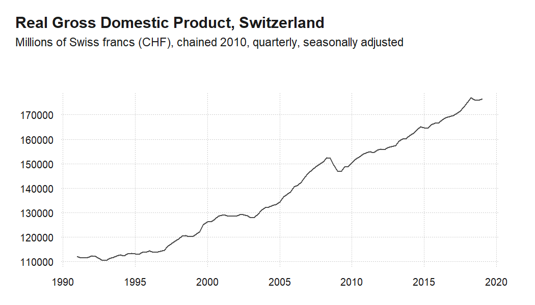
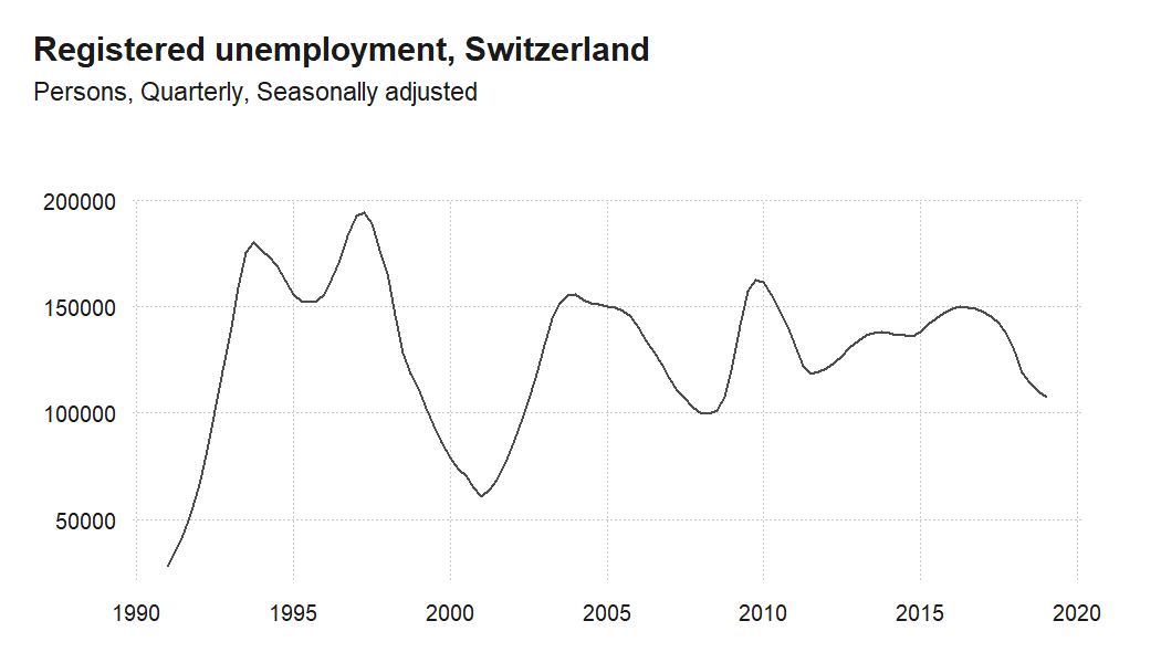
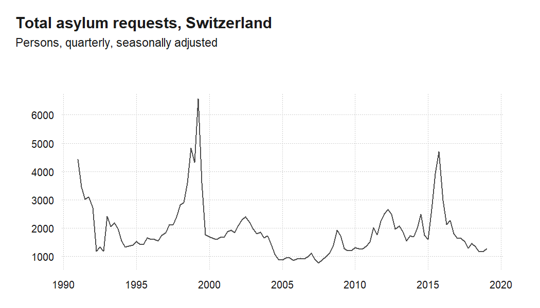
where \(ULV_t\) is the logarithm of the total number of unemployed, \(GDP_t\) is the logarithm of the gross domestic product, and \(ASY_t\) is the logarithm of the total number of asylum applications. For the three variables, I have an uninterrupted, quarterly time series from 1991 to 2019. The \(GDP_t\) variable is differenced so that all series are stationary.
For reference, I plot the evolution of the un-transformed variables used in this analysis from 1991 to 2019 below.
Estimating the model
Once we’ve grouped our variables of interest into a dataframe, we can estimate the model with the VAR() function from the vars package as follows:
#this function retunrs an 'varest' object
var <- VAR(dataset, type = c("const"), lag.max = 12, ic = c("SC"))
Basic impulse response function plots
After estimating our model, the vars package makes computing the impulse response function and plotting the results as easy as can be. We can get the impulse response by simply calling the irf() function on the ‘varest’ object returned from VAR() and specifying the correct arguments.
irf() allows you to specify which variable is your impulse, as well as which is your response. If neither one is specified, the function computes the impulse-response for all available variables in the ‘varest’ object. After calling irf(), the resulting ‘varirf’ object has a specifically defined method that allows a pretty nice plot to be generated with nothing other than a simple plot() call. Below, I show what this looks like when computing the individual impulse-response functions for each of our variables one-by-one in this example, as well as the call and resulting plot when calculating all variable at once.
Default single plots
irf_asy <- irf(var, impulse = "asy", response = "asy", n.ahead = 40, ortho = TRUE,
               cumulative = FALSE, boot = TRUE, ci = 0.9, runs = 100)
#png("figs/irf_asy_quarterly.png", width = 700, height = 500)
plot(irf_asy)
#dev.off()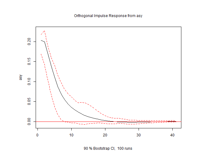
irf_gdp <- irf(var, impulse = "asy", response = "ts_diff.gdp.", n.ahead = 40, ortho = TRUE,
               cumulative = TRUE, boot = TRUE, ci = 0.9, runs = 100)
#png("figs/irf_gdp_quarterly.png", width = 700, height = 500)
plot(irf_gdp)
#dev.off()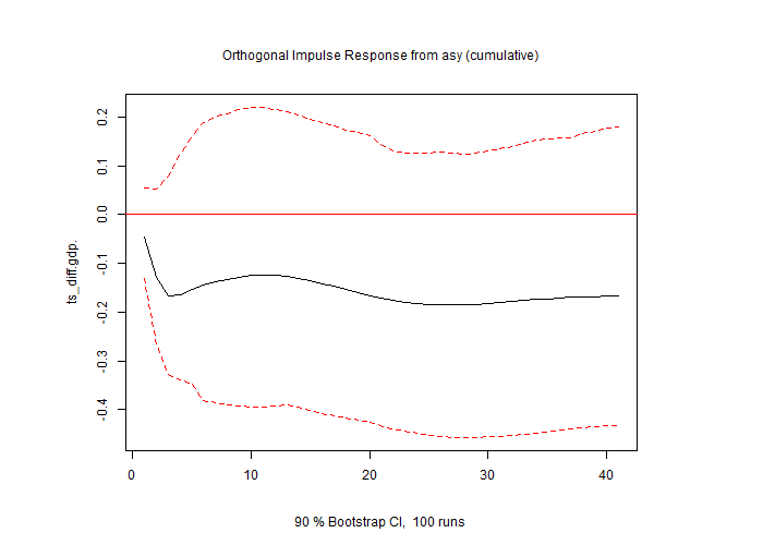
irf_ulv <- irf(var, impulse = "asy", response = "ulv", n.ahead = 40, ortho = TRUE,
                cumulative = FALSE, boot = TRUE, ci = 0.9, runs = 100)
#png("figs/irf_ulv_quarterly.png", width = 700, height = 500)
plot(irf_ulv)
#dev.off()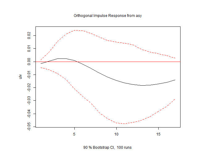
Default multiple plots
irf_all <- irf(var, impulse = "asy", n.ahead = 40, ortho = TRUE,
                cumulative = FALSE, boot = TRUE, ci = 0.9, runs = 50)
#png("figs/irf_all_quarterly.png", width = 600, height = 1000)
plot(irf_all)
#dev.off()
The default plotting function
Despite the absolute ease of generating these plots, there were a couple of things I found challenging working with just these basic plot calls. For one, when generating the multiple plots all at once, I could not find a way to set the “cumulative” argument individually for each impulse-response pair. In order to do this, I had to compute each pair individually, setting the “cumulative” argument differently when needed. While this was easy enough to do, when it came to stacking and saving the individual plots into a grid, the layouts of the base plots made it difficult to get results I wanted.
With regards to customizing the plots even further, when you dig into the plotting method, you find that this base plot takes a number of arguments that allow you to customize your plot:
function (x, plot.type = c("multiple", "single"), names = NULL,
    main = NULL, sub = NULL, lty = NULL, lwd = NULL, col = NULL, ylim = NULL,
    ylab = NULL, xlab = NULL, nc, mar.multi = c(0, 4, 0, 4),
    oma.multi = c(6, 4, 6, 4), adj.mtext = NA, padj.mtext = NA, col.mtext = NA, ...)
But again, I found myself wishing I could pass all of the ‘varirf’ data to ggplot which would be both easier to use and offer greater options for customization.
Extract ‘varirf’ values for use with ggplot
With all of that said, I wrote a simple function to extract the relevant data from single or multiple ‘varirf’ objects and place them in a a nice dataframe that is easy to use with ggplot. The code is available on my github site, or you can source it directly with the following:
library(devtools)
source_url("https://raw.githubusercontent.com/anguyen1210/var-tools/master/R/extract_varirf.R")
extract_varirf
We can use the function to extract a single ‘varirf’ object to give us a nice dataframe that is easy to use with ggplot.
single_varirf <- extract_varirf(irf_ulv)

head(single_varirf)
## period irf_asy_ulv lower_asy_ulv upper_asy_ulv
## 1 0 -0.14906342 -0.4418101 0.1429686
## 2 1 0.06417198 -0.6752656 0.8128328
## 3 2 0.27422541 -1.0712763 1.5095572
## 4 3 0.35804888 -1.5028748 1.9483443
## 5 4 0.28800815 -2.0010168 2.0213136
## 6 5 0.10055672 -2.8470098 1.9597160Similarly, the function takes multiple ‘varirf’ objects, provided they are estimated on the same ‘varest’ object and have the same dimensions, and will bind them into a single dataframe which we can use to plot.
single_varirf_grouped <- extract_varirf(irf_asy, irf_gdp, irf_ulv)

head(single_varirf_grouped)
## period irf_asy_asy lower_asy_asy upper_asy_asy irf_asy_ts_diff.gdp.
## 1 0 2.669010 2.2062257 2.968679 -0.04423716
## 2 1 2.642048 1.9039609 3.043436 -0.12612807
## 3 2 2.250992 1.4200083 2.741123 -0.16699137
## 4 3 1.858352 0.9719803 2.316530 -0.17013317
## 5 4 1.499547 0.5916980 1.941201 -0.16289863
## 6 5 1.195058 0.2854278 1.602548 -0.15753086
## lower_asy_ts_diff.gdp. upper_asy_ts_diff.gdp. irf_asy_ulv lower_asy_ulv
## 1 -0.1530161 0.06408000 -0.14906342 -0.4418101
## 2 -0.2931890 0.04656484 0.06417198 -0.6752656
## 3 -0.3289968 0.04214851 0.27422541 -1.0712763
## 4 -0.3503617 0.06201414 0.35804888 -1.5028748
## 5 -0.3778574 0.10916150 0.28800815 -2.0010168
## 6 -0.4292394 0.14216790 0.10055672 -2.8470098
## upper_asy_ulv
## 1 0.1429686
## 2 0.8128328
## 3 1.5095572
## 4 1.9483443
## 5 2.0213136
## 6 1.9597160Likewise, the function works on a ‘varirf’ object that is called on multiple impulse and/or response objects, and extracts the relevant column vectors into a single easy to use data frame.
# irf_all <- irf(var, impulse = "asy", n.ahead = 40, ortho = TRUE,
#                 cumulative = FALSE, boot = TRUE, ci = 0.9, runs = 50)

multiple_varirf <- extract_varirf(irf_all)

head(multiple_varirf)
## period irf_asy_asy irf_asy_ts_diff.gdp. irf_asy_ulv lower_asy_asy
## 1 0 2.669010 -0.044237163 -0.14906342 2.3499154
## 2 1 2.642048 -0.081890904 0.06417198 1.9490239
## 3 2 2.250992 -0.040863300 0.27422541 1.4914244
## 4 3 1.858352 -0.003141799 0.35804888 1.0578572
## 5 4 1.499547 0.007234539 0.28800815 0.6665857
## 6 5 1.195058 0.005367770 0.10055672 0.3828477
## lower_asy_ts_diff.gdp. lower_asy_ulv upper_asy_asy upper_asy_ts_diff.gdp.
## 1 -0.14100533 -0.4718257 2.952573 0.04650589
## 2 -0.17880385 -0.7224752 3.071094 0.01479263
## 3 -0.09811671 -1.2414712 2.682102 0.03817769
## 4 -0.04072393 -1.7986714 2.128750 0.08999836
## 5 -0.03156608 -2.2152406 1.700868 0.06866572
## 6 -0.02751705 -2.8050166 1.534546 0.04923448
## upper_asy_ulv
## 1 0.1341017
## 2 0.7701823
## 3 1.3993089
## 4 1.8545872
## 5 2.1182943
## 6 2.1401225Impulse-response plots with ggplot
Now that we have all of our computed impulse response function in dataframe, we can more easily take advantage of all the great ggplot and tidyverse functionality to customize our plots however we would like. Below I show a few simple variations, but the possibilities are limitless:
asy_asy <- single_varirf_grouped %>%
  ggplot(aes(x=period, y=irf_asy_asy, ymin=lower_asy_asy, ymax=upper_asy_asy)) +
  geom_hline(yintercept = 0, color="red") +
  geom_ribbon(fill="grey", alpha=0.2) +
  geom_line() +
  theme_light() +
  ggtitle("Orthogonal impulse response, asylum - asylum")+
  ylab("log(total asylum flow)")+
  xlab("") +
  theme(plot.title = element_text(size = 11, hjust=0.5),
        axis.title.y = element_text(size=11))

#ggsave("figs/asy_asy.png", asy_asy, width=6, height=4)

asy_asy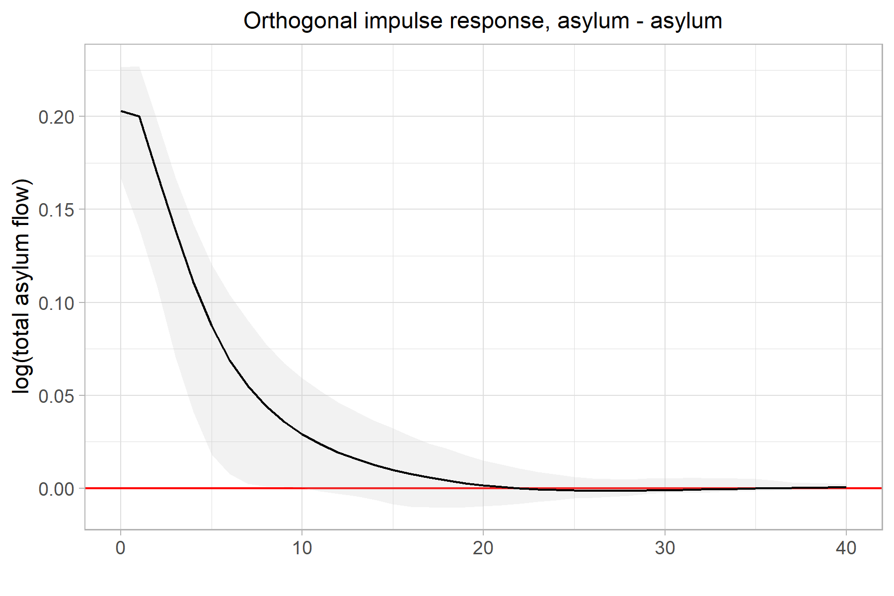
asy_gdp <- single_varirf_grouped %>%
  ggplot(aes(x=period, y=irf_asy_ts_diff.gdp., ymin=lower_asy_ts_diff.gdp., ymax=upper_asy_ts_diff.gdp.)) +
  geom_hline(yintercept = 0, color="red") +
  geom_ribbon(fill=NA, color="grey50", linetype="dashed") +
  geom_line() +
  theme_light() +
  ggtitle("Orthogonal impulse response, asylum - GDP (cumulative)")+
  ylab("\u0394(log(GDP))")+
  xlab("") +
  theme(plot.title = element_text(size = 11, hjust=0.5),
        axis.title.y = element_text(size=11))

#ggsave("figs/asy_gdp.png", asy_gdp, width=6, height=4)

asy_gdp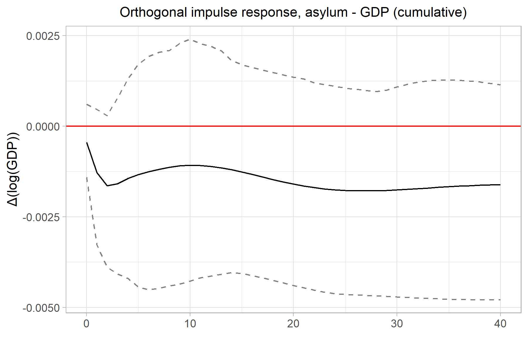
asy_ulv <- multiple_varirf %>%
  ggplot(aes(x=period, y=irf_asy_ulv, ymin=lower_asy_ulv, ymax=upper_asy_ulv)) +
  geom_hline(yintercept = 0, color="red") +
  geom_ribbon(fill="grey", alpha=.2, color="grey50", linetype="dashed") +
  geom_line() +
  theme_light() +
  ggtitle("Orthogonal impulse response, asylum - unemployment level")+
  ylab("log(total unemployment)")+
  xlab("Quarter") +
  theme(plot.title = element_text(size = 11, hjust=0.5),
        axis.title.y = element_text(size=11))

#ggsave("figs/asy_ulv.png", asy_ulv, width=6, height=4)

asy_ulv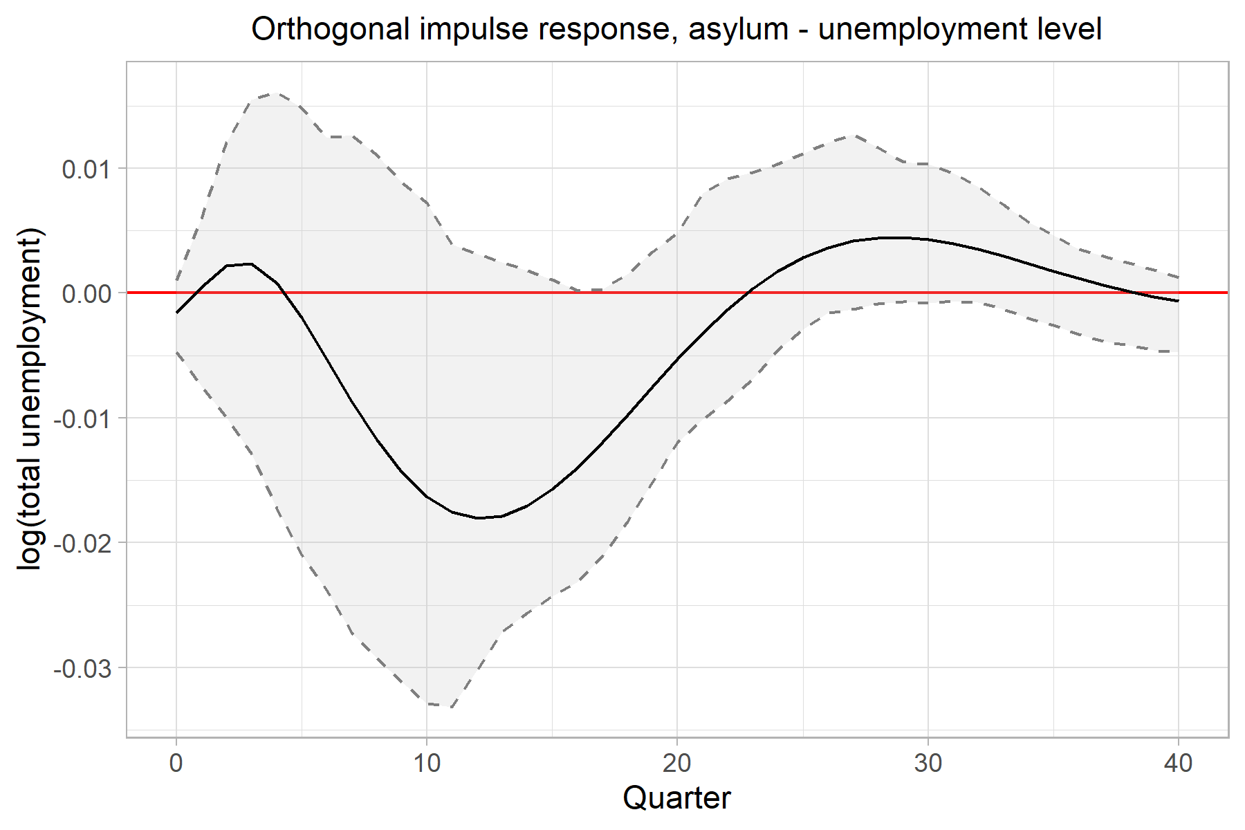
Finally, we can stack the individual plots into a grid pretty easily. gridExtra and cowplot are well known packages for this task. Similarly, I recently discovered Thomas Lin Pederson’s patchwork package which has, perhaps, the simplest syntax for this that I’ve seen so far:
library(patchwork)

p_irf <- asy_asy / asy_gdp / asy_ulv

#ggsave("figs/p_irf.png", p_irf, width=5, height=10)

p_irf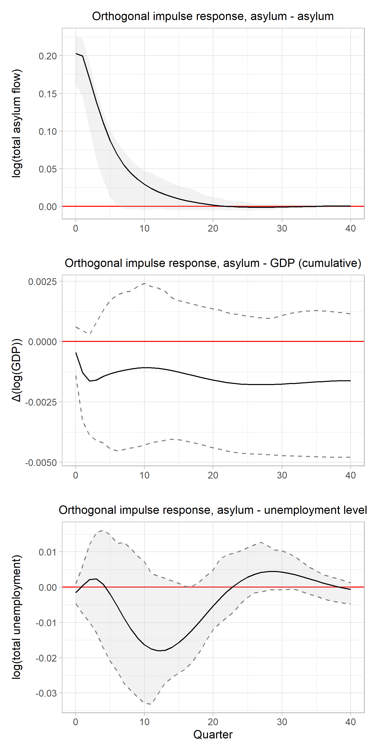
References
d’Albis H, Boubtane E, Coulibaly D (2019). “International Migration and Regional Housing Markets: Evidence from France.” International Regional Science Review, 42(2), 147–180.↩︎
Furlanetto F, Robstad Ø (2019).“Immigration and the Macroeconomy: Some New Empirical Evidence.” Review of Economic Dynamics, 34, 1–19.↩︎