In this post, I evaluate the performance of some popular supervised classification algorithms using caret and the Costa Rican Household Poverty (CRHP) dataset provided by the Inter-American Development Bank (IDB), by way of Kaggle.
The challenge and the data
In Latin America, as in many other parts of the world, accurate targeting of social welfare programs is made difficult given the lack of income and expense records in the poorest segments of the population. To overcome this obstacle, Proxy Means Tests (PMT) are often used to identify those who would qualify for social assistance based on observable household attributes. Hoping to improve existing PMT’s, the IDB sponsored a competition on Kaggle that aimed to identify new methods for more accurately identifying those most in need of social assistance.
Exploratory analysis
In Part I of this post, I re-split, cleaned and pre-processed the original data from Kaggle in order for us to be able conduct our own analysis. In this second part, I will conduct some basic exploratory analysis to see if we can learn anything about our data that will help us with building or model. As these two posts are really aimed at beginners, I display and annotate as much code as possible. To get started, we will make use of the following packages:
library(tidyverse)
library(caret)
library(gridExtra)
library(kableExtra)
library(rpart.plot)
Distribution of poverty levels
This is a question we already looked at a bit when we partitioned our data, but it seems a natural starting point for our exploratory analysis, so we’ll run through it quickly again. First, we can have a look at the distribution of poverty levels in our filtered training set:
train_filtered %>%
  ggplot(aes(as.numeric(Target))) +
  geom_bar(aes(y = ..prop.., fill = factor(..x..)), stat = "count", show.legend = TRUE) +
  geom_text(aes(label = scales::percent(..prop..), y = ..prop..), stat = "count", vjust = -.5, size = 3) +
  scale_y_continuous(labels = scales::percent) +
  ylab("relative frequencies") +
  ggtitle("Relative frequency of poverty levels, filtered training set") +
  theme_minimal() +
  theme(axis.text.y = element_blank(), axis.title.y = element_blank(), axis.title.x = element_blank()) +
  scale_fill_viridis_d(name="Poverty level (Target)",
                      breaks=c("1", "2", "3", "4"),
                      labels=c("1 = extreme poverty", "2 = moderate poverty", "3 = vulnerable", "4 = non-vulnerable"))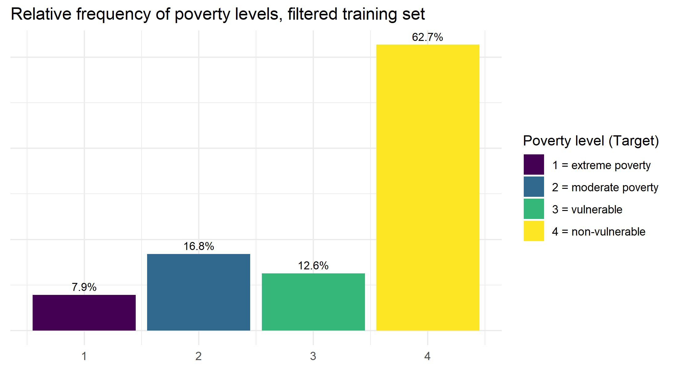
The first thing we notice is that we have an imbalanced set of classification targets. Those labeled as belonging to the extreme poverty group only show up 8.1% of the time, while those who are not vulnerable to falling into poverty are prevalent 62.8% of the time. We will keep this in mind later when choosing our model training and evaluation metrics.
Distribution of other numeric variables
When we imported our data into R all numeric variables were converted to the class
# identify any columns that take on values more than 0:1
no_dummy_index  <- apply(train_filtered, 2, function(x) { !all(x %in% 0:1) })

# subset out the no dummy columns
no_dummy <- train_filtered[ , no_dummy_index]

# print names of no dummy columns
names(no_dummy)
## [1] "Id" "idhogar" "rooms" "r4h1"
## [5] "r4h2" "r4h3" "r4m1" "r4m2"
## [9] "r4m3" "r4t1" "r4t2" "r4t3"
## [13] "tamhog" "tamviv" "escolari" "hogar_nin"
## [17] "hogar_adul" "hogar_mayor" "edjefe" "edjefa"
## [21] "bedrooms" "overcrowding" "qmobilephone" "age"
## [25] "Target"We notice a few things here: besides our two ID variables, which we can ignore, there’s a mix of individual and household-level variables. After consulting the descriptions for all of these, I’ll just examine a few that may be of more interest:
age, Age in yearsescolari, years of schoolingqmobilephone, # of mobile phonestamviv, number of persons living in the householdovercrowding, # persons per roomhogar_nin, Number of children 0 to 19 in household
We can have a look at how these variable are distributed according to the poverty-level of the indvidual in the plots below:
#define function to plot feature variable against target
plot_target_by_var <- function(df, variable){
    var <- enquo(variable)
    df %>%
  ggplot(aes(!!var, fill = as.factor(Target), color = as.factor(Target))) +
  geom_density(alpha = 0.1, size = 1, show.legend = FALSE) +
  scale_colour_viridis_d() +
  theme_minimal()
}

#plot variables of interest
p_age <- plot_target_by_var(train_filtered, age)
p_escolari <- plot_target_by_var(train_filtered, escolari)
p_qmobilephone <- plot_target_by_var(train_filtered, p_qmobilephone)
p_tamviv <- plot_target_by_var(train_filtered, tamviv)
p_overcrowding <- plot_target_by_var(train_filtered, overcrowding)
p_hogar_nin <- plot_target_by_var(train_filtered, hogar_nin)

#display plots in a grid
grid.arrange(p_age, p_escolar, p_qmobilephone, p_tamviv, p_overcrowding, p_hogar_nin, nrow = 2, top = textGrob("Distribution of selected features by `Target` class", gp=gpar(fontsize=15)))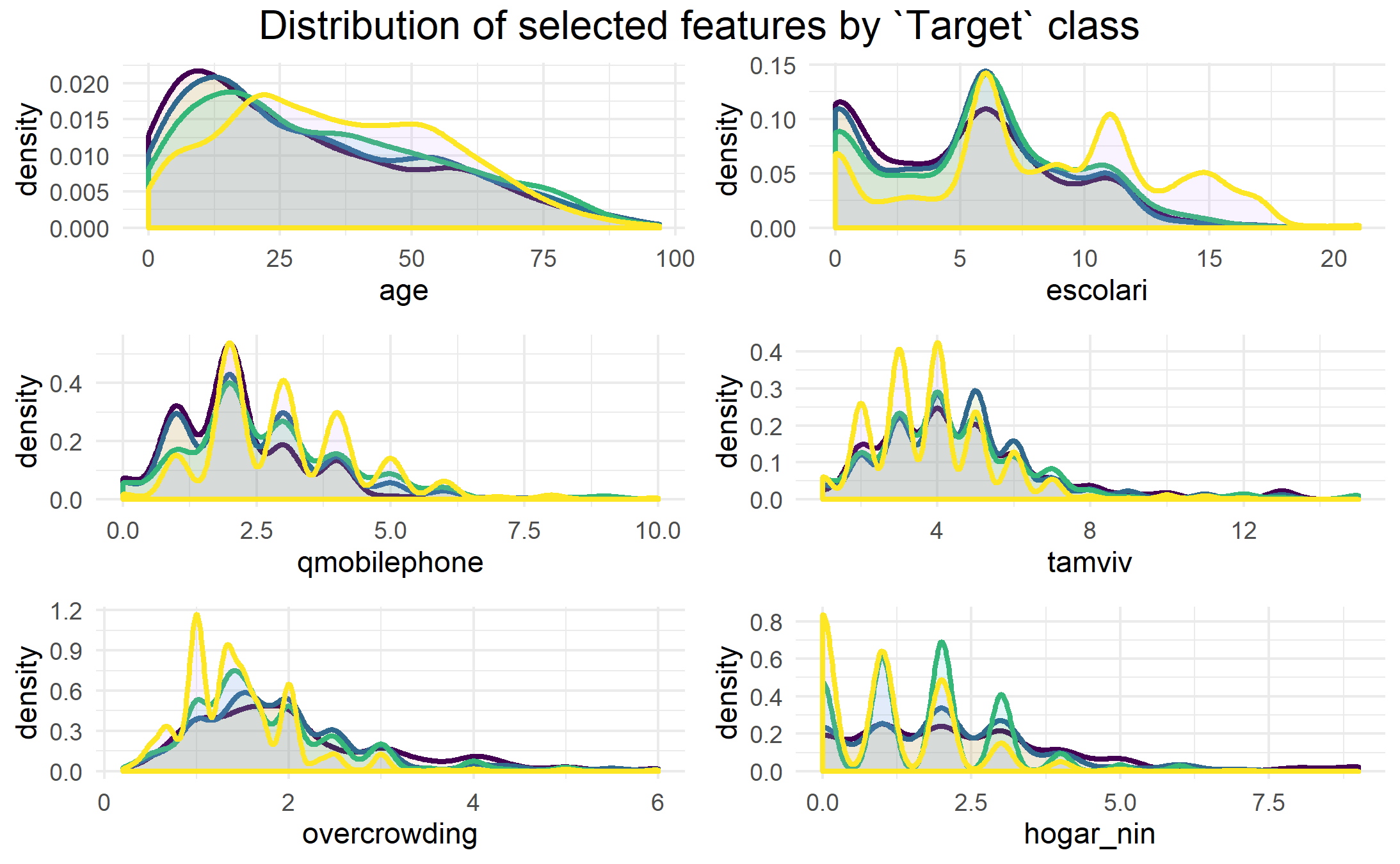
From these density plots, we can see that those labeled as being in the most extreme poverty (purple line) are likely to be much younger, and have less education than the other groups (which would go together, naturally). With regards to education (escolari), we can also see that those who are labeled as not vulnerable to poverty (yellow line) are much more likely than the other groups to have greater than 12 or so years of education. Furthermore, we can see that there is a slightly higher tendency for extremely and moderately poor households to have more people living in the house (tamviv) in the 7+ persons per household range, and similarly, they tend to have more overcrowding in terms of the 2-4 persons per room range.
Correlation to Target variable
Another thing we can look at before we start building up our model is the correlation between the Target poverty levels with all of the features we’ve retained so far in our dataset.
##    escolari     epared3  pisomoscer   cielorazo       rooms paredblolad
##   0.3220620   0.2956923   0.2850161   0.2746833   0.2641804   0.2532956
##  instlevel8      edjefe    bedrooms        v18q
##   0.2341791   0.2298932   0.2159925   0.2069992
The list above are the top 10 variables that correlate most strongly with our Targetvariable in either direction. In addition to some of the variables we just looked at, we see a few of the binary dummy variables high up in this list, including epared3 which indicates if the walls of the home are good, pisomoscer indicating if the floors are made of ceramic, paredblolad indicating if the home walls are brick, and cielorazo indicating whether or not the house has a ceiling.
Modeling
While the original Kaggle competition had participants only focusing on making their predictions for the heads of each household (parentesco= 1), to make our job simpler in this analysis, we will just be making a prediction for all individuals in the dataset.
Our approach will be to run a small number of different machine learning models on our training data using just the default settings to get and idea of how they each perform. After our initial run through, we could then pick a few models and see if we can better tune them and improve our predictions.
Just before we start, we can drop both of our ID variables (Id, idhogar). Additionally, we need to transform or Target variable into a factor at this stage in order to ensure our machine learning models treat this problem as a classification task.
# drop ID variables from both `train_filtered` and `test_filtered`
train_filtered <- train_filtered[ ,3:78]
test_filtered <- test_filtered[ ,3:78]

# transfrom `Target` into factor for both sets
train_filtered$Target <- as.factor(train_filtered$Target)
test_filtered$Target <- as.factor(test_filtered$Target)
Fitting different classification models
For this first part of our modelling exercise, we will just try out a few of the most well-known classification algorithms that are covered in the caret package. As we are dealing with imbalanced data, the default parameter we will try to optimize during training will be Kappa in order to boost our performance. This can be done by adding the metric = "Kappa" argument to our train()call.
For performance and speed improvements, we will use a 10 K-fold cross validation to fit our models, which we can implement using the trControl function in caret.
We can fit all of our initial models on the training data with the following code:
# define models to try
models <- c("multinom", "lda", "naive_bayes", "svmLinear", "knn", "rpart", "ranger")

# set CV control for knn, k-folds
control <- trainControl(method = "cv", number = 10, p = .9) # 10 fold, 10%

# fit models
set.seed(1)

train_models <- lapply(models, function(model){
    print(model)
    train(Target ~ ., method = model, data = train_filtered, trControl = control, metric = "Kappa")
})

names(train_models) <- models
Evaluation: Macro scores
It is important to choose the right metric for evaluating the model. Knowing the we are performing a supervised multi-class classification task on unbalanced data, we should look at alternatives to the standard overall accuracy measure. Specifically, we need to account for issues of prevalence, as people belonging to the class labeled as extreme poverty make up only 8% of our data, meaning that if our model fails to predict these people correctly (low sensitivity) it will not lower our accuracy much. In order to take into account the balance between sensitivity and specificity, for this project, we will use the \(F_1\) score, which is used to give a one number summary that is the harmonic average of precision and recall.
The standard \(F_1\) score for all of our class predictions can be calculated as such: \[ F_1 = 2 \times \frac{\mbox{precision} \cdot \mbox{recall}} {\mbox{precision} + \mbox{recall}} \] It can also be useful for us to look at a one number summary of this \(F_1\) score, so we will compute both the Macro-\(F_1\) and the Weighted-\(F_1\), each of which try to balance the importance of the different classes in our dataset. (Follow the link for a nice summary of Macro-\(F_1\) and Weighted-\(F_1\) scores.
To calculate the Macro-\(F_1\), we just take the average of the \(F_1\) scores for all our classes (\(1,...,k\)) , so that: \[ \text{Macro}\,F_1 = \frac{1}{k} \sum_{i=1}^{k} 2 \times \frac{\mbox{precision}_i \cdot \mbox{recall}_i} {\mbox{precision}_i + \mbox{recall}_i} \]
For the Weighted-\(F_1\), we perform a similar calculation, only that we weight the \(F_1\) score by the number of samples from that class. So, for each of our clusters \(1,...,k\), where \(k\) has an actual number of \(n\) in our sample, we can compute the weighted average so that: \[ \text{Weighted}\,F_1 = \frac{n_i \sum_{i=1}^{k} 2 \times \frac{\mbox{precision}_i \cdot \mbox{recall}_i} {\mbox{precision}_i + \mbox{recall}_i}}{\sum_{i=1}^{k}n_i} \]
The Macro-\(F_1\) gives equal weights to all classes, so it should give extra emphasis to our under-represented classes, whereas the Weighted-\(F_1\) gives emphasis proportional to the size of each class. We can extract the relevant evaluation metrics from our list of fitted models using caret and the following code:
# extract elapsed training times
elapsed <- sapply(train_models, function(object)
    object$times$everything["elapsed"])

# extract accuracy from CM in one step without creating a separate predictions vector
acc = sapply(train_models, function(x){
    pred = predict(x, newdata = test_filtered)
    cm = confusionMatrix(pred, reference = test_filtered$Target)
    return(cm[["overall"]]["Accuracy"])
  }
)

# extract F1 by class
F1 = sapply(train_models, function(x){
    pred = predict(x, newdata = test_filtered)
    cm = confusionMatrix(pred, reference = test_filtered$Target)
    return(cm[["byClass"]][ , "F1"])
  }
)

# extract macro F1
F1_M = sapply(train_models, function(x){
    pred = predict(x, newdata = test_filtered)
    cm = confusionMatrix(pred, reference = test_filtered$Target)
    return(mean(cm[["byClass"]][ , "F1"], na.rm = TRUE))
  }
)

# extract weighted F1
F1_W <- sapply(train_models, function(x){
    pred = predict(x, newdata = test_filtered)
    cm = confusionMatrix(pred, reference = test_filtered$Target)
    actual = colSums(cm$table)
    F1 = cm[["byClass"]][ , "F1"]
    return((sum(actual*F1, na.rm = TRUE))/(sum(actual)))
  }
)
Here we compile our evaluation metrics into a table for comparison:
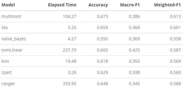
A few things jump out immediately from this summary: (1) the range of speed at which these models run is quite varied. On one end, linear discriminant analysis (LDA) (lda), naive bayes (naive_bayes), decision tree (rpart) were extremely fast and only took a matter of seconds to compute; while at the other end, multinomial logistic regression (multinom), support vector machine (SVM) (svmLinear), and random forest (ranger) took 30 to 100 times longer to run. Our K-nearest neighbor (knn) is in the middle, and ran relatively fast. With regards to how these model fitting times relate to performance, we can go through each of our evaluation metrics one-by-one.
Speed vs. Accuracy
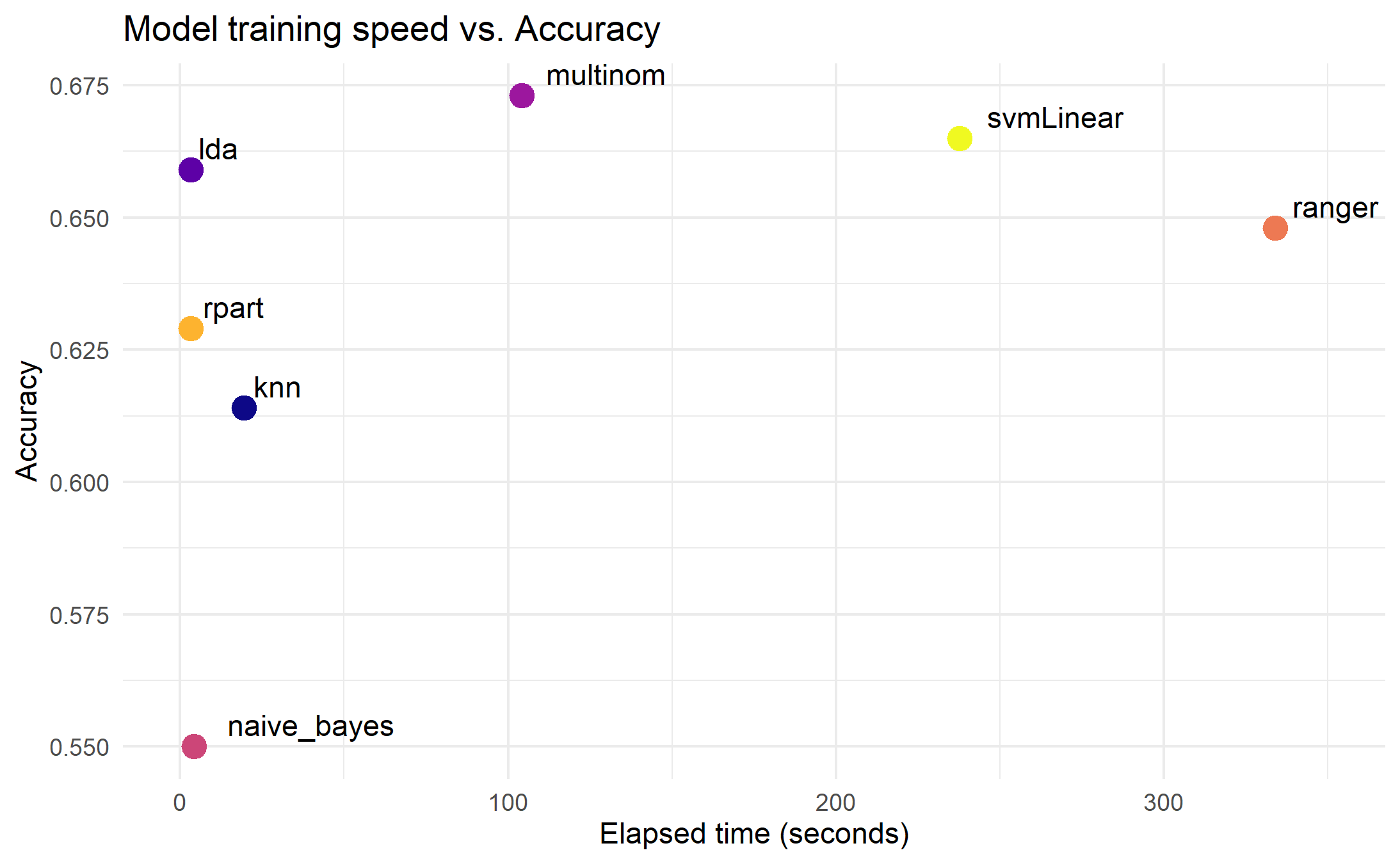
Looking at the overall accuracy scores we can see that multinomial logistic regression outperforms that other models, though the computational time is towards the long end. For the fastest running models, LDA gives the best accuracy.
Speed vs. Macro-F1 Score

When we look at the Macro-F1 scores, the picture changes quite a bit. The models seem to stay in their same speed groupings, but the best performing model is now our decision tree (rpart), with the SVM, coming in second-place. Given the gap between our implementation of rpartand the rest, I’m inclined to think there was a problem with this Macro-F1 calculation, so we will table this point for further exploration later.
Speed vs. Weighted-F1 Score
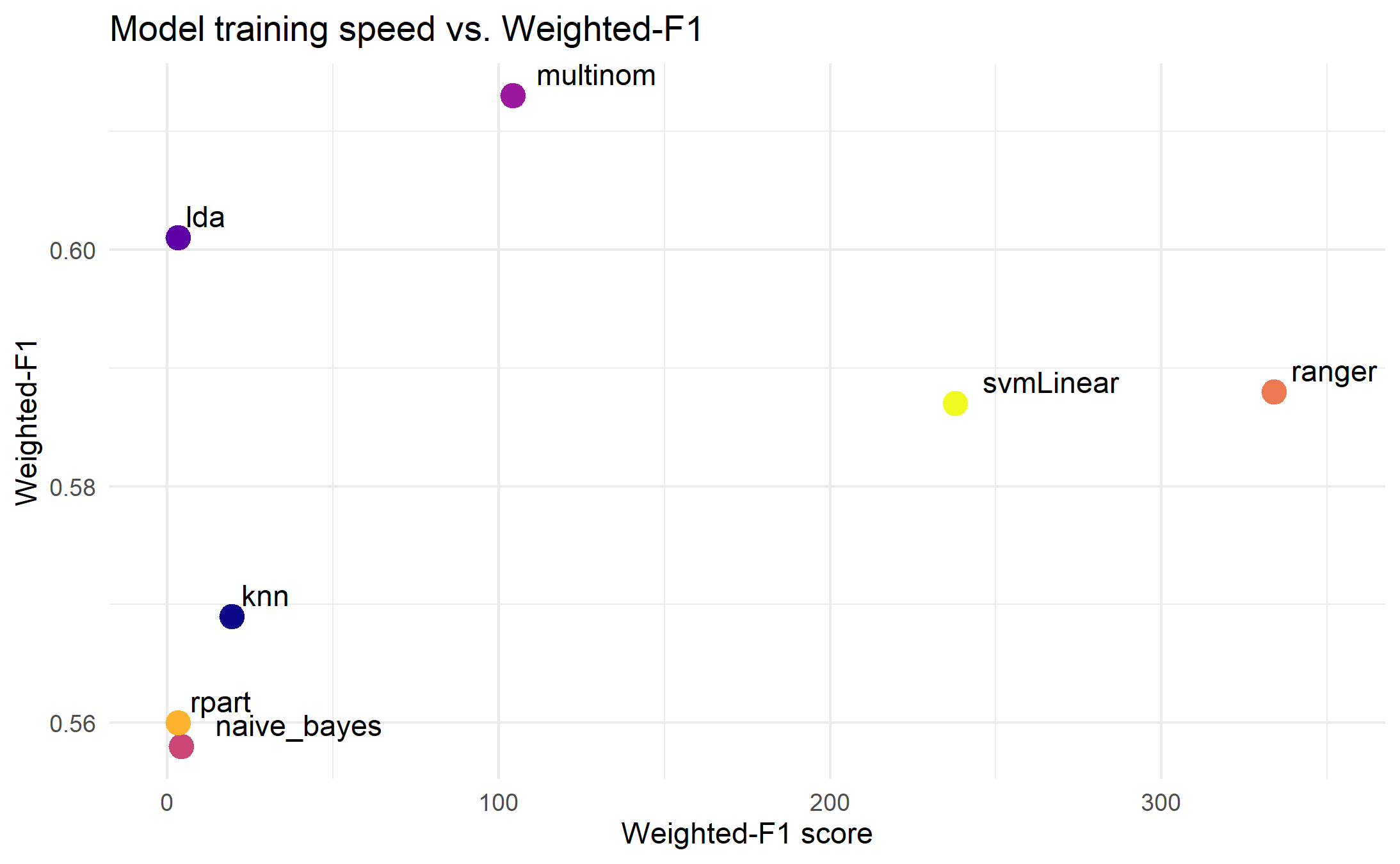
Much like when using our accuracy metric, our implementation of multinom had the best performance here, followed by lda.
Evaluation: Micro scores
We’ve seen above that there our macro-averaged metrics seemingly indicate that multinom is giving us the best performance, though at a cost of moderately long computational time, while much more quickly, lda, rpart, or even knn are doing reasonably well using only a fraction of the same time.
Given that our prediction task is focused on an imbalanced class set, and also given that the most underrepresented class (i.e. “extreme poverty”) is, in fact, the one that we are most interested in, it might be worthwhile to have a look at some the F1 metrics for each of these class predictions to see which models are doing the best.
\(F_1\)-score by class
First we can have a look at a summary table of the \(F_1\)-scores we computed for each class over all of the models:
F1 %>% kable() %>% kable_styling()
Immediately we can spot some problems–namely, the NaN and NA values in svmLinearand rpart. This is certainly distorting our calculation of the Macro-\(F_1\) and Weighted-\(F_1\) scores for those two models, which should be kept in mind.
For Class: 1, the “extreme poverty” category, we can see that naive_bayes, is, in fact, performing the best.
which.max(F1[1, ])\(F-\beta\) score by class
While the \(F_1\) score accounts for both sensitivity and specificity (i.e. recall). The \(F_1\) score weighs the importance of these two metrics equally, but we can add weights to emphasize which of the two are more important to us. For example, in this project, as we are most interested in the least-represented class in the dataset (Class: 1, “extreme poverty”), we can use different \(F_\beta\) scores to give greater importance to recall our calculation of the standard \(F_1\) metric. We calculate the \(F_\beta\) score with:
\[
F_\beta = (1 + \beta^2) \times \frac{\mbox{precision} \cdot \mbox{recall}}
{(\beta^2 \cdot \mbox{precision}) + \mbox{recall}}
\]
For this measure, the \(\beta\) takes on a number between 1 and \(\infty\), where a value of 1, simply just returns the \(F_1\) score. Just to see how our models react, I will compute an \(F_2\) and \(F_3\) score and evaluate.
F2 <- sapply(train_models, function(x){
    pred = predict(x, newdata = test_filtered)
    cm = confusionMatrix(pred, reference = test_filtered$Target)
    precision = cm[["byClass"]][ , "Precision"]
    recall = cm[["byClass"]][ , "Recall"]
    return((5*precision*recall) / (4*precision + recall))
  }
)

# extract F-Beta by class
F3 <- sapply(train_models, function(x){
    pred = predict(x, newdata = test_filtered)
    cm = confusionMatrix(pred, reference = test_filtered$Target)
    precision = cm[["byClass"]][ , "Precision"]
    recall = cm[["byClass"]][ , "Recall"]
    return((10*precision*recall) / (9*precision + recall))
  }
)
Class 1: Extreme Poverty
class1 <- rbind(F1[1, ], F2[1, ], F3[1, ])
row.names(class1) <-  c("F1", "F2", "F3")
class1 %>% kable(caption = "F-Beta Scores, Class: 1, Extreme Poverty") %>% kable_styling()
In the table above, we can see how the different \(F_beta\) scores affect our Class: 1 performance as we give increasing weight to recall in our evaluation. The most striking finding here is that as the \(\beta\) value increases, the \(F_\beta\) values for all of the models decrease, except for naive_bayes, which actually starts to perform better.
Class 4: Non-vulnerable
class4 <- rbind(F1[4, ], F2[4, ], F3[4, ])
row.names(class4) <-  c("F1", "F2", "F3")
class4 %>% kable(caption = "F-Beta Scores, Class: 4, Non-vulnerable") %>% kable_styling()
Looking at what happens to predictions at the top end of our class distribution, we find that as the \(\beta\) value increases, all of our models start to perform better except for naive_bayes which actually begins to perform worse.
Feature importance
One final thing that would be interesting to look at is the relative importance of the features used to make the predictions. With rpart, we can extract this information relatively easily. As we noted above, there were a few models that returned \(F_1\) scores of NA, and rpart was one of them. This can happen with a a simple decision tree classifier, as sometimes, there are not enough observations of a particular class to make a difference to the error measurement of the classifier so the class just gets dropped. This issue could potentially be fixed by using upsampling or downsampling techniques, but for the moment, let’s just have a look at the final model:
#plot decision tree
rpart.plot::rpart.plot(train_models$rpart$finalModel)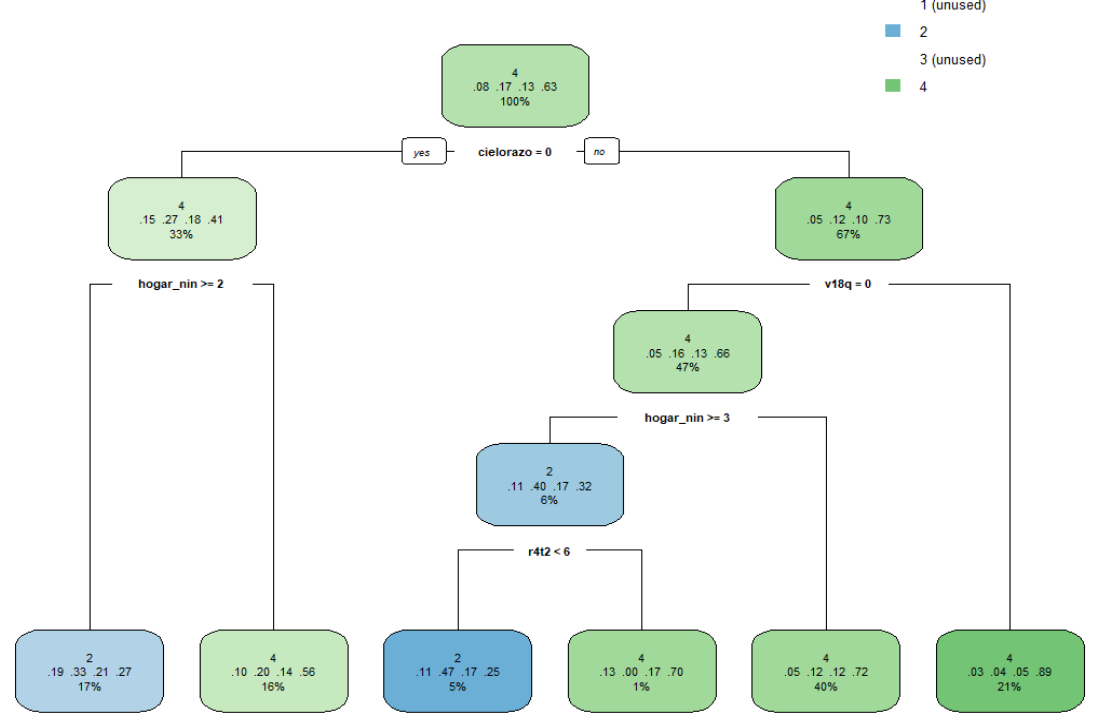
This, of course, is an incomplete picture as the Class: 1 and Class: 3 labels were dropped from this model, but in terms of the most important features used to calculate the overall accuracy, we can get an idea of what variables were considered the most important. The thing that stands out the most here is that, apart from v18q, which is a dummy variable capturing whether or not an individual owns a tablet, all other splitting nodes are ones that capture information specific to the household, rather than the individual.
More directly, we can call up a list of the most important features using the varImp function from caret. Among all of the models we have tried to fit so far, the only other model that accepts this function is multinom, so we will call this one up as well to compare. Below is the top 10 most important variables for our decision tree and multinomial logit model:
get_imp <- function(modelname){
    imp <- data.frame(varImp(modelname)$importance)
    imp$Variable <- rownames(imp)
    imp <- imp[order(-imp$Overall)[1:5], ] %>% select(Variable, Overall)
    rownames(imp) <- 1:5
    return(imp)
}

imp_multinom <- get_imp(train_models$multinom)
imp_rpart <- get_imp(train_models$rpart)

get_imp <- function(modelname){
    imp <- data.frame(varImp(modelname)$importance)
    imp$Variable <- rownames(imp)
    imp <- imp[order(-imp$Overall)[1:10], ] %>% select(Variable, Overall)
    rownames(imp) <- 1:10
    return(imp)
}

cbind(imp_rpart, imp_multinom) %>% kable(caption = "Top 10 important variables, `rpart` vs. `multinom`") %>% kable_styling()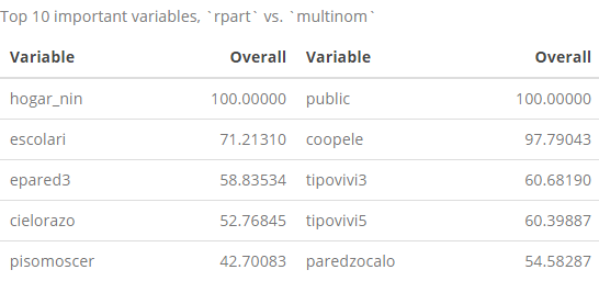
With regards to the top-10 most important variables from the rpart list, we’ve seen most of these names already in the decision tree and in the list of the 10 most correlated variables with out Target variable list that we showed earlier. More interestingly, the list of the ten most important multinom variables is completely different than anything we’ve seen so far, which s is also interesting as this was identified as one of the highest performing models among the ones we’ve tested.
Some concluding remarks
Using our re-split CRHP data, were were able to build and test a few of the most widely known classification models to predict the relative poverty levels for individuals in Costa Rica. We trained seven models in total: multinomial logistic regression, linear discriminant analysis (LDA), naive bayes, support vector machine (SVM), K-nearest neighbors, decision tree, and random forest.
We computed a few different evaluation metrics to analyze the performance of our models, taking into account there overall average performance in predicting among all classes, as well as their performance predicting in the class we are most interested in, the extreme poor. Depending on what we emphasized as most important, different models performed better or worse than the others. For overall predictive performance, multinom and lda appeared to do the best, though time it takes to fit the lda model is a fraction of the time it takes to run the multinom model. When turning our attention to predictive performance for class of extremely poor, we found that naive_bayes outperformed the other models in our current set-up.
Possible next steps
As can be seen from the evaluation results, there is a lot of room for us to try to improve our predictive results. While that was not necessarily the aim of this particular post, for a future follow-up, there are many things we could do to try to improve upon our initial efforts here. For a future Part III to this series, we could look into:
- optimizing the best-performing model–this current analysis helped us identify some models that seemed to perform better than others. For a follow up, we could select some of these models, and then try to improve their performance specifically.
- feature engineering–while we did some very basic pre-processing of our data to reduce its dimensionality, we did not try to create new features or integrate data from other sources to help improve our model.
- optimize \(F_\beta\)-score \(\beta\) values–For our evaluation metrics, we just looked at three \(\beta\) values, but \(\beta\) can take on values up to \(\infty\). In the future, we could try to optimize this value and see how it affects performance of our classifier for both the least and most represented classes.
- upsampling/downsampling–we could also try other techniques to address our class imbalance issues such as upsampling and downsampling.
- binary classification–in fact, if we are most interested in identifying the most vulnerable populations are, we could simply transform the
Targetlabel in our dataset and turn this problem into a binary classification challenge. This would potentially simplify what we need to do allow us to build higher performing (more accurate) predictive models.
